Take the Stairs Campaign Poster

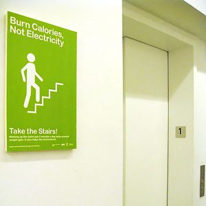
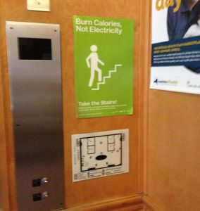
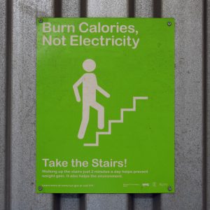
I designed this poster when I worked for the city. It is likely the most reproduced thing I’ve made. “In a study, researchers from the New York City Department of Health and Mental Hygiene placed simple green signs that read “Burn Calories, Not Electricity” next to elevators in three buildings: a three-story health clinic, a 10-story affordable housing building, and an eight-story academic building. Then they watched to see if more people chose to take the stairs.

The results of the study, which will appear in the February issue of the American Journal of Preventive Medicine, were pretty astounding. Stair use increased immediately at all locations by amounts ranging from 9.2% to 34.7%. And it doesn’t seem that tenants and employees got tired of taking the stairs, either. As Karen K. Lee, the author of the study, said, “The gains in physical activity continued to be observed nine months after the signs were first placed.””

-Fast Company

City Lights Design Competition

I was selected to a paid internship to work directly with the architect of this design competition, Patricia Knoblock. She called herself old Eagle Eye, and enjoyed sitting over my shoulder while I worked. She also directed an international competition to get NYC a new street light. I was a little nervous at first being the lead designer on this but I’d just done a bunch of my classmates online portfolios and have been laying out graphics since high school so this was a challenge but one I met bringing what I knew and what I could learn to bare. I look up and smile when I see the new lamps going up, its a personal wink and nod I share with NYC…

Thomas Phifer and Partners, New York City
structural engineer: Werner Sobek lighting design: Office for Visual Interaction photovoltaic engineering: Transsolar manufacturing partners: LED Specialists, Fraen, and Erco renderings: dbox
design features: LED technology; extruded aluminum pole, T-shaped slots for slide-and-lock system to incorporate add-ons; new asymmetrical base design; and photovoltaic component.

Tennis in the Bronx

Here are some samples from the design and production process. From design iterations to mock ups, to identifying the actual site locations in relation to the graphics, and managing enormous and complex files the whole process took about a year and a half. My design inspiration for built spaces is usually the topic and a concept, so tennis, and nature. I extruded that concept through the racket and the ball, rackets as branches, rackets and balls as crystals or geometric fractals… balls at dramatic scale! With such a vast scale I imagined being able to run toward the screen and feel as if you would plunge into the tennis verse and fly from ball to ball, like an astronaut. 

DDC Brand Identity

Design and Construction, imagination and production… what is there and what is not there. What was and what will be, or is there, only as scaffolding, or infrastructure? These questions are in the logo design. The negative space defining the letters  represents the agency being behind the scenes but actually responsible for shaping the city. 

With the launch of the new brand identity, came the need to reaffirm the mission statement. Here were some screen savers, and posters we issued to identify our touch points and our reason for being. We Build The City.

One of the major triumphs of the rebranding for me was finding an efficiency that improved overall brand cohesion and streamlined a process. Traditionally there was just a spec sheet for the production of construction signs, which invariably meant every sign was different, from stretched logos to different fonts. Under the rebrand I identified the .pdf form with fields as the way to insure uniform sign production, cutting production time, user error, and hands involved, thus reducing expense. 

Engine Company 277, The Bronx, The construction sign that went up announcing the coming of this fire station to the community.

The space to the left of the first D was controversial during design discussions. If a city agency can’t exhibit the self restraint to keep a margin in its logo, how could it be trusted to do the complex tasks of operating a major metropolis? We gave ourselves design challenges every day as reminders of our mandate. 

Redesigning the website for the DDC was daunting, it was the sort of design challenge that required designing a process to complete. The amount of information design involved in meetings was enormous. Identifying content types, user types, stake holder access, update ability, modularity, and best practices. I had a hand in every aspect of the design, and a lot of the code. There was in instance where I actually found some scripting errors that had stumped our IT guys. 

Content included in many instances is collaborative, thanks to teams and partners for working with me, let’s keep going!

phone:917.679.8307       email:cercare24@yahoo.com       (c) Chromakid 2022